

Consultancy for freelancers and small businesses
The website of a consultancy for freelancers and small businesses: digital identity, redesign, a custom WordPress theme and automated invoicing.
TLDR
Context
Seplia handles bookkeeping, taxes and paperwork with the tax office and social security. It also listens to each client’s idea to find grants, subsidies and people heading the same way.
The challenge
I started working with Seplia in May 2026. The founder knew the website had to change: as she told me, it wasn’t bringing in clients. Through interviews I got to understand how the consultancy works, who it’s for and what it needed the website to do.
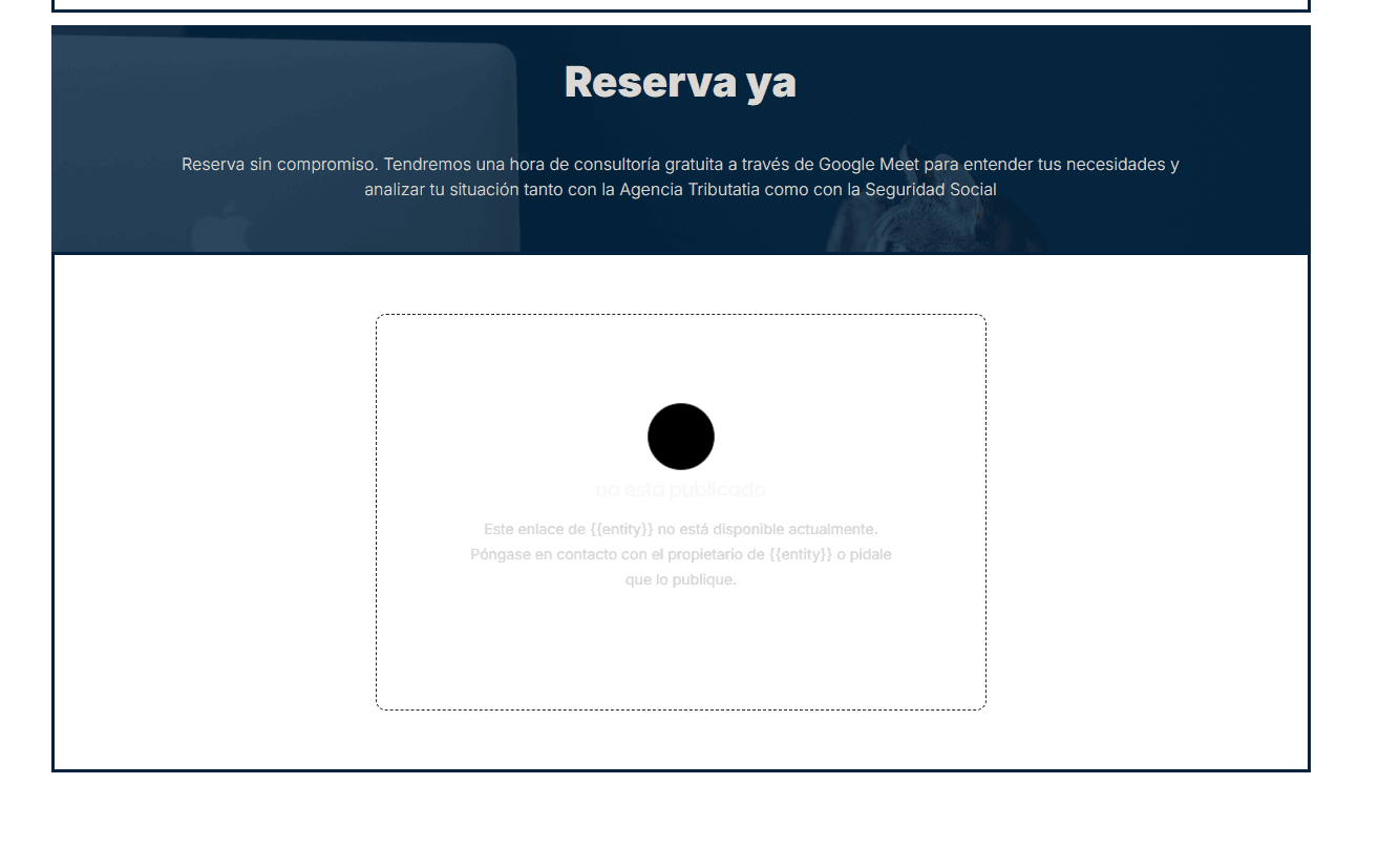
Looking at the old website, the problem was obvious. It didn’t use the brand: it was navy blue, with a different typeface, for a brand that is black and white. And it promised things that didn’t work: the block for booking the free hour only showed “not published”, the site announced an ecosystem section that didn’t exist, six links led to missing pages and the WhatsApp button had no number.
The brand was fine. The website didn’t respect it, and didn’t deliver what it promised either.
These are the four decisions that mattered most.
Decision 01
The brand already existed: the cat in a suit, its typeface, black as the only color and its own voice (clients are “los seplitos”). But it was designed for print, and a website needed more pieces: grays for secondary text and borders, a dark version and text sizes for each heading level.
Add only those pieces, in a digital identity system. The stamp lettering stays in the headlines, where it adds personality, and long text moves to a more readable typeface. And twelve illustrations of the cat go with each section, so Seplia’s fondness for cats runs through the whole website.
I always separated what came from the brand manual from what I was proposing, so the founder knew exactly what she was approving. And every new piece had to read well: I calculated the contrast of each gray against the backgrounds (the one that stands out least is only for borders, never for text), and I changed the typeface for long text because the brand’s one looked too thin at small sizes on black. We’re still testing it so it reads even better.
Decision 02
Seplia offers three services (tax advice, business consulting and grants) to people in very different situations, from an idea on a napkin to a company with a team. And the action where everything starts, booking the first hour for free, didn’t work.
Organize the website two ways, by service and by situation, and end every page with the same action: booking the first hour for free. Before adding anything, I removed what didn’t work. I designed it in Figma and validated it with the founder along the way: first the prototypes, then ongoing feedback.
The two-way structure came out of the interviews with the founder, and the free hour is exactly for anyone who isn’t sure where to start. Removing before adding came first: a consultancy sells peace of mind, and a website that promises what it doesn’t have does the opposite.
Decision 03
The old website was built with Elementor, a visual editor for WordPress whose license had expired: sticking with it meant paying for it again or going without updates. We had also agreed to work in phases: a first version that got the essentials right, and the rest later.
Build the website as a custom WordPress theme, in other words the code that decides how each page looks and how it’s organized. Each home page section is an independent piece and each page loads only the styles it needs. And, now that the site is live, no change is made on the real website.
Since I can code, it was simpler to build it myself than to make Seplia depend on outside subscriptions and licenses. And working with independent pieces, on a copy, is what makes it possible to move in phases without putting what already works at risk.
Decision 04
Seplia issues its invoices in Perfex, its client management software (which is also the private client area), and keeps its books in Quipu. Every invoice was exported by hand, client by client.
Automate what repeated every month: invoices go out automatically at the start of the month, anyone who hasn’t paid gets a reminder mid-month, and a Perfex module moves each invoice to Quipu without exporting it by hand.
I started from the way they work: I looked for the tasks that repeated every month and automated them between the two programs Seplia already used. All of this already runs in the consultancy’s day-to-day work.
Outcome
There’s no traffic or lead data yet: the website has only been live for a short time. What there is is the founder’s reaction: she loves the result. My bet is that, with the next phases, the website will start bringing in the clients it didn’t before.
What I learned
When the brand already exists, the job is to decide what it’s missing to work on screen, and to be clear about what comes from the manual and what’s yours.
